As we begin to look towards H2, at Big Dog we like to reflect on popular design choices seen so far to help us anticipate what is to come for the rest of the year.
As clients both new and old look to keep their sites looking fresh and staying on trend, it is always helpful to have some examples ready for them to look at.
More… is more?
As the great Leonardo Da Vinci once said “Simplicity is the ultimate sophistication”, and as much as we believe in this philosophy, unfortunately, you aren’t living in 2024 Leo.
As companies fight for the fleeting attention of internet-goers it is crucial for you to stand out and catch those wandering eyes. From big bold fonts, to stacking your page with bright colours and images, ultimately the flashiest sites will be what draws in the customers.
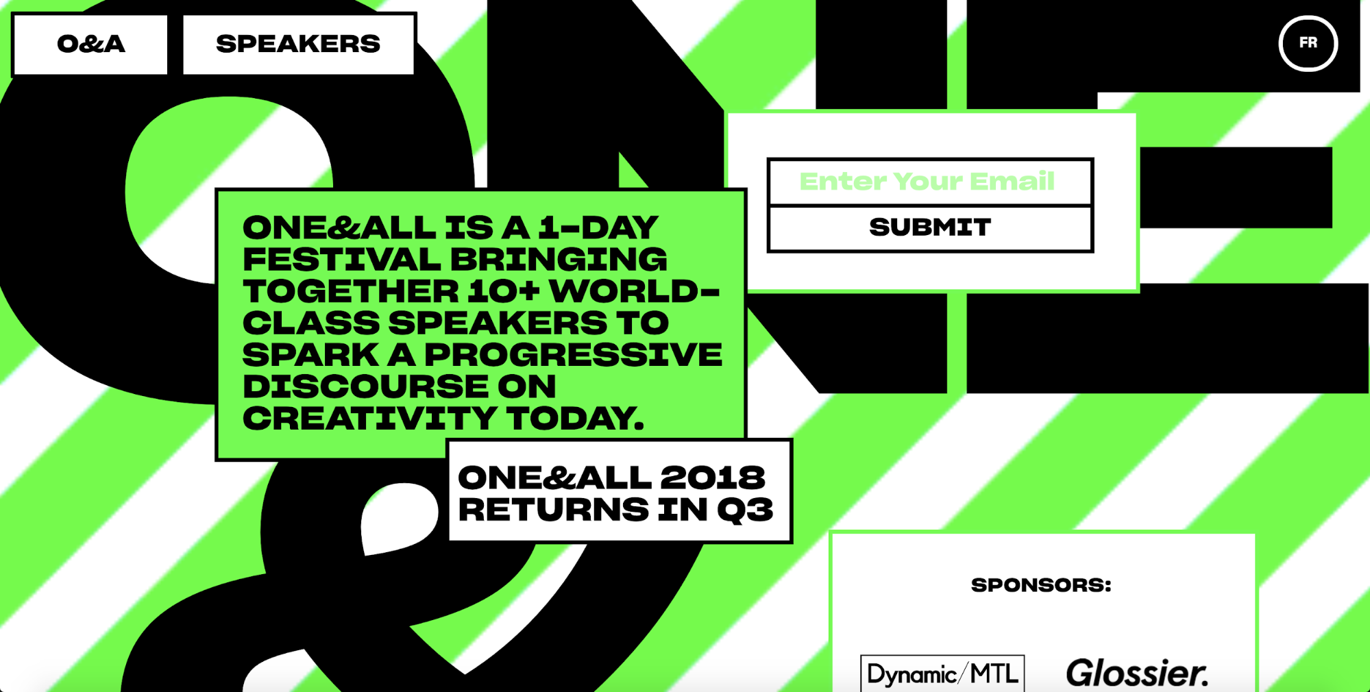
Retro Y2K Design
As I am sure you are aware by the increasing number of mullets walking down the street, late 90’s to early 2000s style is back, and it’s not just for your jorts. Many websites are utilising this trend that has seen increasing popularity over the last few years.
Piggy-backing off the maximalist design mentioned above, bright neon colours and large fonts are the way to go. This funky and out there design choice is sure to make a statement and keep you hip with the kids.
AI Tools
A topic that has been in the mouths of failing college students and Hollywood elites alike is Artificial Intelligence, so it is no surprise it has creeped its way into design trends for this year.
As we have mentioned in a another article, AI has come a long way in the last few years and now can generate creative and helpful examples for designers. Put your key words Into any AI generator for the images you are looking to include on your site and AI will be able to generate hundreds of examples to be used.
With anything, AI is to be used in moderation to not take away from the thousands of real artists around the world creating images like these.

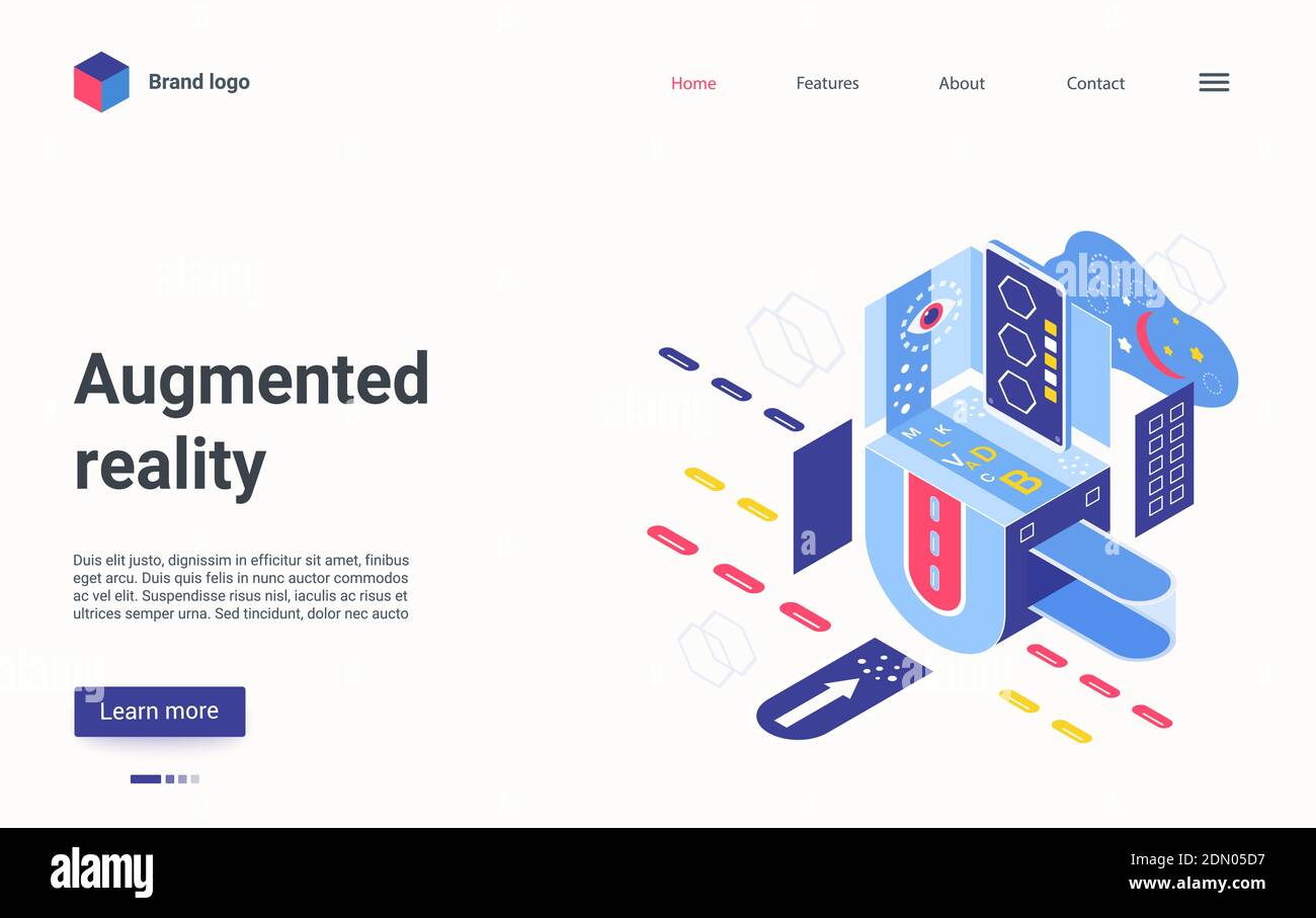
3D Imaging
People want to know what it is they are buying, whether it be a new phone or a service. Adding a 3D image to your site can help bring it to life, and allow the viewer to experience your product before they invest. As well as this, adding a three dimensional avatar to your site can help give the site some character. All popular media has its mascots, from minions to the android robot. These give a mental image any time they hear your name, these little 3D icons will help you stand out in a crowd.
These 3D images can help add a layer of depth to your site, the animations or icons fill the space and the dimensions of the piece will help your site feel larger and full of character, they can be used to show maps, or even just be a little person to guide you through the site, the possibilities are endless.
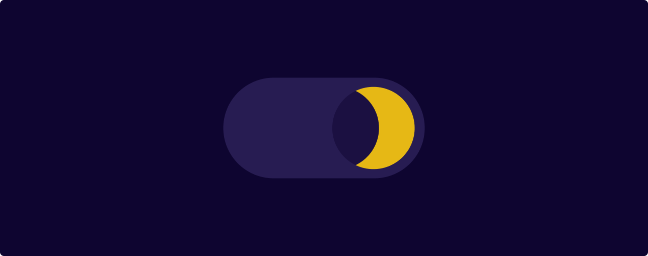
Dark Mode Design
Although apple and android released their dark mode update years ago, to some people the darkened background with white text makes reading sites that little bit more appealing.
Giving the user an option to toggle between these two contrasting settings on your site allows the user to give themselves the best experience they can get.
As well as this, the use of dark mode too can reduce the strain on your eyes due to the duller colours, dark more can also reduce the battery usage on your phone, so it makes sense as to why people are continuously utilising this feature.
Conclusion
Of course these current trends aren’t for everyone and while some may stick around longer than others, remember that trends are just that, ‘a trend’ and perhaps fleeting at best.
While you may think about taking some of these new concepts into account when visualising your site, it is important to think about your actual user/customer base.
Think about your demographic, their likes/dislikes and barriers to entry. Always keep in mind accessibility and best practice but most of all remember at the end of the day you’re building the site for them.